
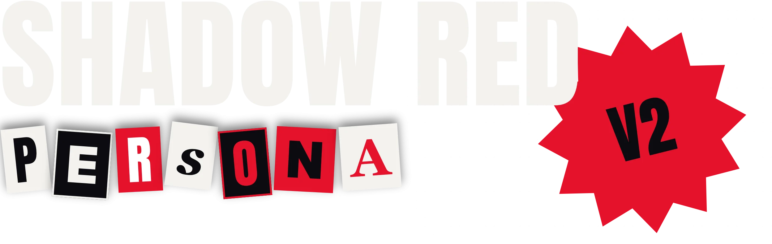
"Do something different." An offhand thought became the catalyst for initiating Shadow Red in 2018, giving Shadow Red Persona the chance to be showcased here.
Beginning
The Shadow Red Persona theme (codename: Phantom Glass) marks the first complete refactor of the Shadow Red theme (hereafter referred to as "SR").
Initially, SR was a WordPress theme modified from the Hello theme, with inspiration drawn primarily from the color palette and elements of the game Persona 5 (hereafter "P5"), as well as certain design aesthetics from Apple's website. By freely combining elements and pairing bold colors with fluid animations, SR delivered a striking visual impact. "Shadow" represents the dark backgrounds and the Phantom Thieves operating in the dark, while "Red" embodies the iconic red from the game, shining bright amidst the dark.
All along, the design of the SR theme has revolved around black and red, paired with frosted glass to create visual impact while incorporating certain constraints (a sacrifice made for readability) and tech-inspired elements. Across the past four versions—from defining the colors and overall structure, refining components and standardizing templates, to integrating more frosted glass across interactive interfaces, and introducing the #Tag design in the previous release to highlight titles and key points—this constant addition without subtraction began taking a toll on webpage loading speeds. To put an end to mounting performance overhead and accumulating technical debt, the entire theme was rebuilt from scratch on the new Shadow Red CMS framework (yes, the framework and the theme originally shared the exact same name).
Shadow Red Persona
The design philosophy of the remade theme can be summarized as: personal rebellious style under the P5 color scheme. During the design phase, I experimented with incorporating "exaggerated" elements throughout—such as oversized heading typography, a homepage stripped of body text, and Phantom Thief-style page transition effects. The theme strives to cover virtually everything within sight, echoing how the Phantom Thieves in P5 always STEAL THE SPOTLIGHT with their stylish entrances.
To stay true to the overall aesthetic, the theme's color palette is strictly limited to red, black, and white as much as possible. Most interactive and decorative elements utilize red paired with quadrilaterals. For example, eyebrow tags feature theme-colored rectangles laid diagonally across the page as a simplified collage-style typography design, aiming to "label" the content browsed by visitors while balancing style and readability. Sections with heavier body text return to containers reminiscent of frosted and transparent glass.
For typography, Anton was ultimately chosen. Anton is a free font for both personal and commercial use. When used for headings, its distinct typographic characteristics deliver a powerful visual presence, while its compact structure fits more information into headlines and minimizes awkward line breaks.
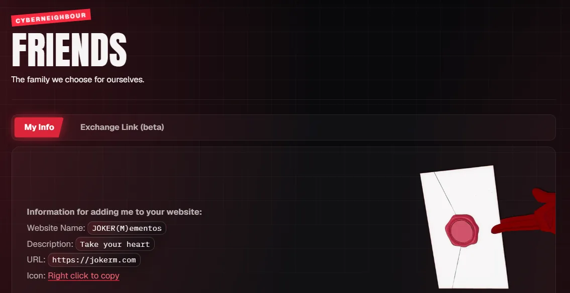
Beyond the foundational design, additional Phantom Thief aesthetics were sprinkled in, such as the invitation letter on the Friends page. Feel free to discover the other easter eggs on your own :)
Closing Thoughts
Throughout development, there were no universally elegant solutions or one-size-fits-all designs. Everything was built strictly to satisfy a distinct style (or perhaps, a personal indulgence). After all, we wear so many different identities in this world—never forget to just be yourself once in a while.
Copyright declaration
This post was written by JokerM.
Comments 0
No comments yet.
Leave a comment
Replying to